ADA Compliant Fonts: The Overlooked Key to Accessible Signage
When most people think about signage, they focus on color, material or placement. But there’s another critical design element that often gets overlooked: the font. Typography plays a powerful role in how people interact with a space and under the Americans with Disabilities Act (ADA), certain requirements exist to ensure signage is legible and accessible to everyone.
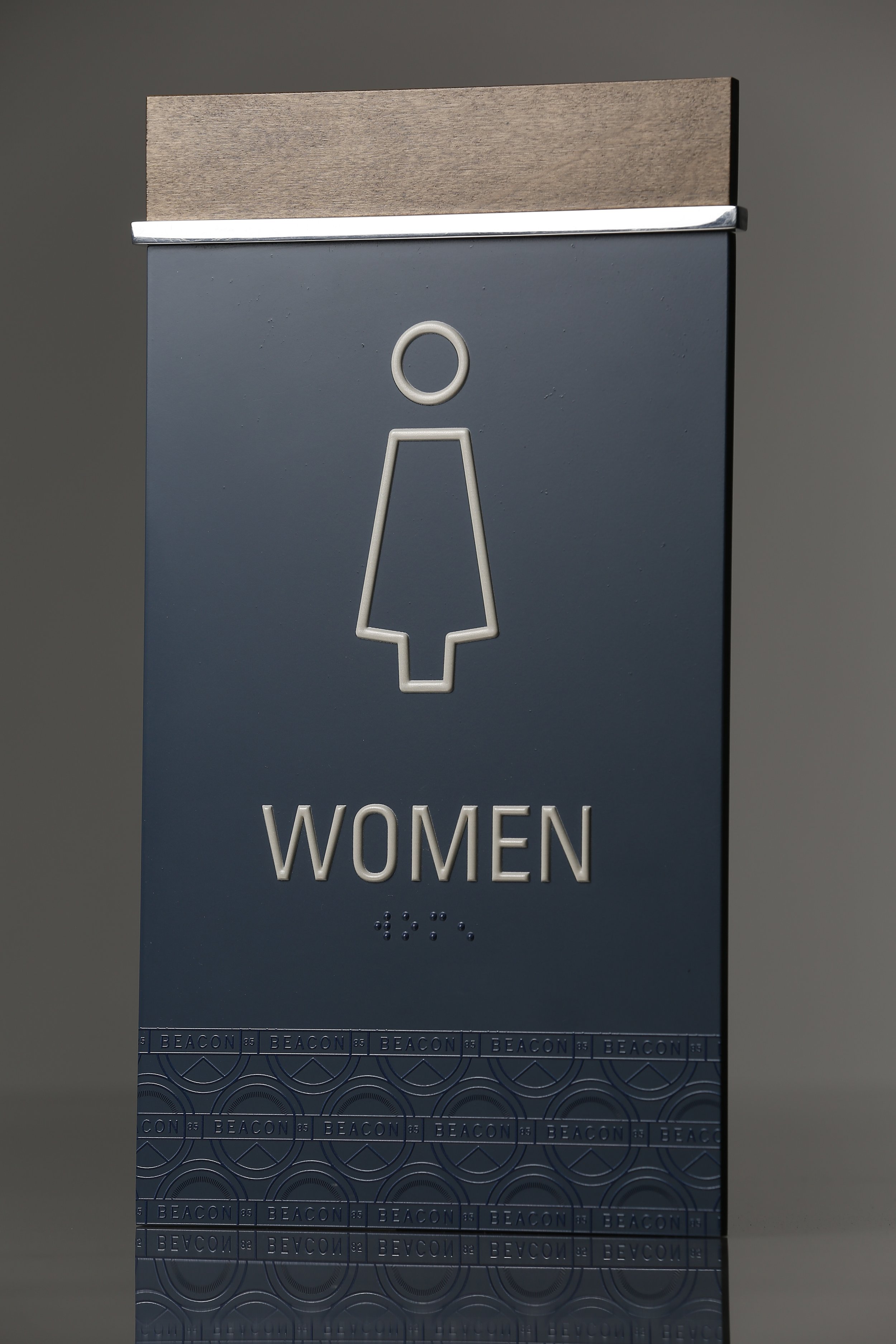
When it comes to ADA signage, not all signs are created equal. The rules for tactile copy—the raised characters you can feel by touch—are different from the rules for visual-only informational or directional signs. At Boyd Sign Systems, we specialize in ADA-compliant signage and know how important it is to get these details right.
Let’s break down why ADA-compliant fonts matter, and how they shape the way we design.
What Makes a Font ADA Compliant?
ADA guidelines are clear: not every font makes the cut. The rules were written to remove ambiguity and ensure consistency across environments. Here’s what you need to know:
All Uppercase
Unlike visual-only signage, tactile copy must be in ALL CAPS. This ensures uniformity and improves legibility for both sighted readers and those reading by touch.Sans Serif Fonts Only
Simple, sans serif fonts (like Helvetica, Arial, or Futura) are required. No italics, scripts, condensed or decorative styles are allowed.Stroke Thickness Matters
Stroke thickness is critical for readability. The stroke width of characters must be between 10–15% of the character’s height. Too thin, and letters become fragile; too thick, and letters blur together.Character Proportions & Spacing
Characters must have proportions that are neither too narrow nor too wide, with spacing that ensures letters are distinct from one another.Height Requirements
Raised characters must be between 5/8 inch and 2 inches tall. This makes them large enough to read by touch, but not so large that proportions break down.High Contrast
Raised characters must contrast strongly with their background. Contrast is essential for low-vision users.
Why ADA Compliance Goes Beyond the Law
Sure, meeting ADA font requirements is a legal necessity—but the impact goes far deeper.
Safety: In emergency situations, every second counts. Clear fonts ensure exit, stairwell and directional signs can be read instantly.
Consistency: Standardized fonts and strokes ensure uniform experiences across facilities.
Design Integrity: Believe it or not, following ADA rules doesn’t mean sacrificing aesthetics. With the right design team, compliant fonts can blend seamlessly with architectural vision.
Directional & Informational Signs: Different Rules
It’s important to note: directional and informational signs (like: Conference Room →) do not require tactile characters. These signs may use upper and lower case characters, a wider range of fonts and are generally focused on visual legibility at a distance.
Boyd Sign Systems’ Expertise
For decades, Boyd Sign Systems has been at the forefront of creating signage solutions that are not only compliant but also beautifully crafted. We understand that fonts need to serve two masters: regulatory compliance and brand identity. Our team works with designers, architects and developers to ensure font choices meet ADA standards without compromising the visual story a brand wants to tell.
Whether it’s a casino, a apartment community or a corporate headquarters, the right font becomes part of the environment’s personality—while also ensuring every person can navigate the space with confidence.
Fonts may seem like a small detail, but in signage, they carry outsized responsibility. ADA compliance ensures that signage isn’t just seen, but understood, by everyone. It’s where design meets accessibility, and where creativity meets responsibility.
We know ADA Codes and Compliance can feel complicated. That’s why we’ve created two resources to make it easier:
ADA Compliant Tactile Typefaces
ADA Tactile and Visual Code Requirements