Visual ADA Fonts: Clarity You Can See
When people think about ADA Signage, tactile letters and Braille often come to mind—but accessibility doesn’t stop at touch. Fonts also play a critical role in visual clarity, legibility and consistency. Under the Americans with Disabilities Act (ADA), there are specific standards for visual characters—the printed or displayed text that guides us through buildings, campuses and public spaces.
At Boyd Sign Systems, we believe every detail matters. Whether you’re creating wayfinding signage, digital displays or informational panels, choosing the right font ensures your design is compliant, beautiful and easy to read for everyone.
ADA Section 703.5 outlines the requirements for visual characters, focusing on readability at a distance, consistent proportions, and strong contrast.
Let’s break down what makes a visual font ADA compliant. Here’s what you need to know:
Upper and Lower Case Allowed

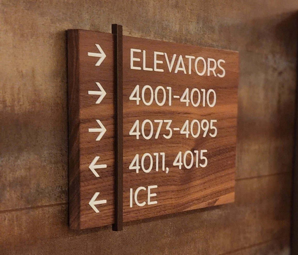
Unlike tactile signage (which must be ALL CAPS), visual signs can use both upper and lower case letters. Mixed case improves word recognition, making messages easier to read at a glance.
Font Style: Keep It Conventional
Visual ADA fonts must be simple and sans serif. Avoid decorative, condensed, or script styles that hinder readability. Fonts like Avenir, GT America, or Helvetica balance compliance and design sophistication.
Stroke Thickness and Proportion
The thickness of the uppercase “I” must be between 10% and 30% of the character height, while the width of the uppercase “O” must be between 55% and 110% of the “I” height. These proportions ensure letterforms remain clean and consistent.
Character Spacing and Line Spacing
Spacing matters.
Character spacing must be between 10% and 35% of the character height.
Line spacing (baseline to baseline) must be between 135% and 170% of the character height.
These rules prevent crowding, which is especially important for people with visual impairments.
Character Height
Letter height is based on viewing distance.
For example:
Signs viewed up to 6 feet away require characters at least ⅝ inch tall.
Larger distances require proportionally larger characters—up to several inches for long-range wayfinding.
Finish and Contrast
Visual ADA signs must have a non-glare finish and high contrast between text and background. Whether your design uses light text on a dark background or the reverse, clarity and contrast are key.
Why Visual ADA Compliance Matters
ADA compliance isn’t just a legal requirement—it’s good design. Visual ADA signage:
Improves navigation by ensuring everyone can read messages quickly and clearly.
Enhances safety by creating clear visual guidance in emergencies.
Strengthens brand consistency by balancing accessibility with aesthetics.
When visual and tactile elements work together, your signage system becomes intuitive, inclusive, and visually seamless.
We take pride in designing signage that combines compliance, craftsmanship and creativity. Our team understands that ADA rules don’t limit design—they guide it. Whether it’s a hotel, hospital or corporate headquarters, we ensure every sign we produce meets ADA requirements and reflects the space’s architectural intent.
Fonts may seem like a small detail, but they carry big responsibility. Visual ADA standards ensure signs aren’t just seen—they’re understood. It’s where clarity meets design, and where accessibility meets innovation.
We’ve Simplified ADA Compliance
We know ADA Codes and Compliance can feel complex. That’s why we’ve created two easy-to-use resources to help you get it right:
Visual ADA Font Reference Guide
Contrast and Sizing Chart